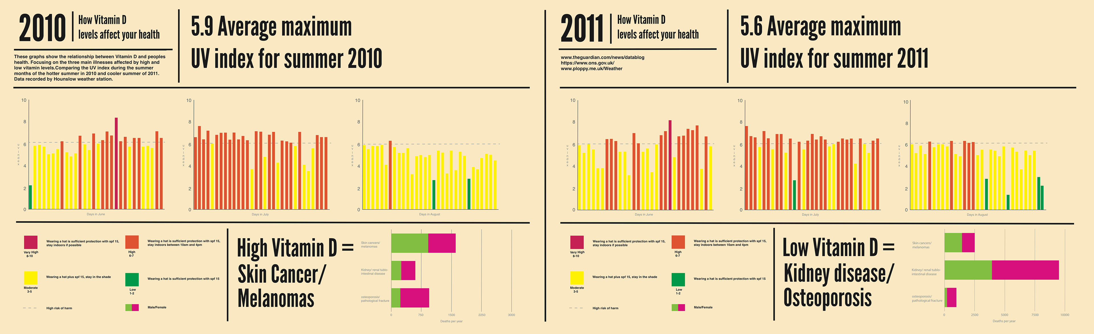
The Data Visualisation compares weather data in comparison to health data. Looking at the warmer summer of 2010 in the UK, in the area of Hounslow, London and comparing this to the cooler summer of 2011. Displaying the UV scale for each day during the summer months of June-August and corresponding the danger levels through UV scale colours. Then comparing this weather data to health data in the UK. Focusing on illnesses relating to high or low levels of Vitamin D such as skin cancer and kidney disease. Visualising how high vitamin D or low Vitamin D intake can affect your health.
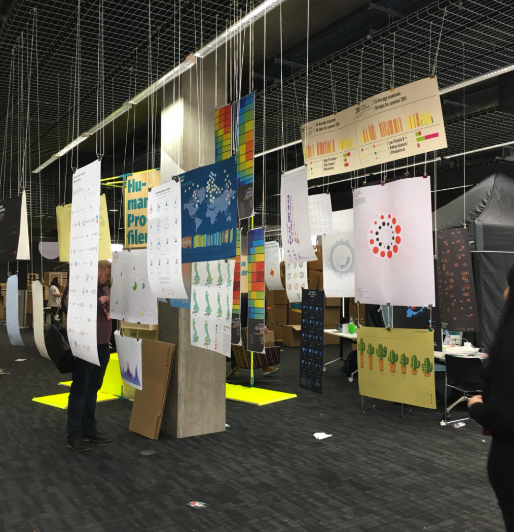
My Data Visualisation was then exhibited at Mozfest 2016 at Ravensbourne University London. As part of a talk presented in collaboration with Ravensbourne Graphic Design students, including myself along with the Met Office, with a discussion about data and the relation it has to Graphic Design.